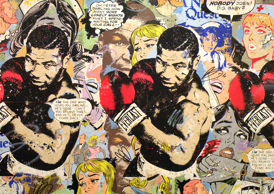
A guy I know books a lot of the shows for punk venue,
924 Gilman St. I’ve done a lot of fliers for the shows. Recently, this booker asked me to create a poster for the upcoming last Northern CA show of
Seven Generations and
Die Young. The booker essentially gave me carte blanche on the design so long as it was hand drawn and black/white/green. I was about to leave on vacation and asked if I could let him know in one week on June 8th. I knew it could be quite a challenge and a lot of work. However by the 8th, I had decided to go ahead with the project. My main reason was for the practice of executing an assignment… and I did love the idea of my work being printed as a poster; giving me some nice exposure.
From the get-go, it was obvious that this poster needed to be printed asap. In order for me to have any time to get it done, I would need, at the very least, two full weekends of work. I proposed Monday July 20th as the date I could have it to the booker. He agreed if it could be in his hands by that date and no later. I work fulltime and my weekday evenings are regimented so tight that those two weekends were the only assured time to work on the poster. Then I got sick. I was hit by a terrible cold and had to take almost 3 full days off from work. I had originally planned on taking time off from my job to complete the poster as needed but this kinda killed that idea. I also was unable to really focus on the project while I was out-of-it sick.
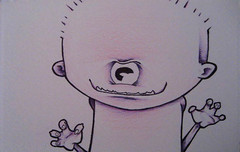
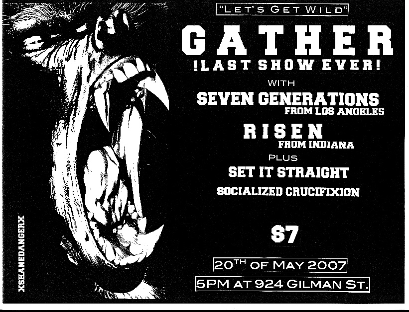
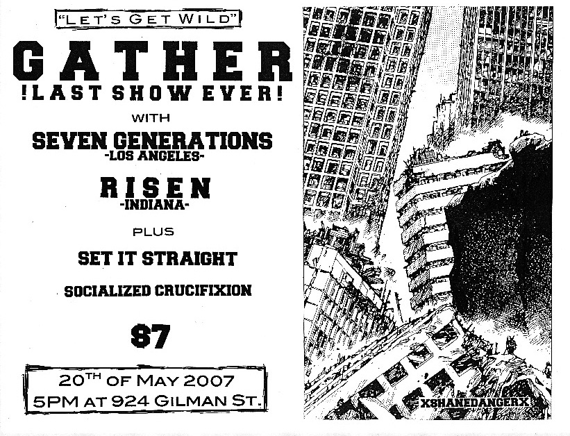
During our initial discussion on the poster, it was suggested that it NOT be Morrissey related. Seven Generations cultivate the Unbroken/Moz-worship cult and the booker seemed less than amused at it. I thought that was funny and immediately envisioned a sort of homage to Morrissey and his sense of tragedy. I sketched a figure with a pompadour crying into his arm as if he was losing a friend or lover.
It was heavily influenced by
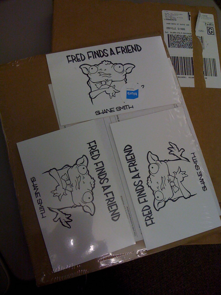
Jay Ryan. Ryan’s work is a major reference point for me in regards to incorporating design elements and text into my illustration work.
This influence becomes important later on.
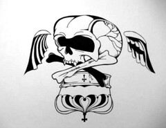
Although I liked this concept, with the given 11’’x17’’ poster format, I just didn’t think I could make the character dynamically fit into the space. This size was a major problem for me as it meant that I could not draft the whole thing out to scale and even if it was all hand drawn, it would need to involve a lot more digital work than I am accustomed to using. I really wanted a design element that was relevant to Seven Generations’ politics and spent way too much time trying to think of something involving animal liberation. I tossed out the emo Moz dude and restarted with a
Rudy Fritsch-inspired skull. I was using some of Fritsch’s design sense to play on the tale of folk scientists
mistaking an elephant skull for a Cyclops skull. The logo of old thrash band
Rigor Mortis also was on my mind. The more difficult aspect was tying this (or any) design into the overall composition (especially the text).
I had spent a good amount of time on creating hand drawn text for three of the bands but wasn’t too sure on that text matching the skull design. I started going in the direction of a faux comic book cover. I sent the new slick digitally created Seven Generations logo and skull design to the booker and member of one a supporting band. It seemed that my comic book idea was being conveyed but the booker told me to make sure Seven Generations and Die Young had equal top billing. This made me reconsider the text and eventually to call into question the relevance of the skull design and its connection to the rest of the poster.
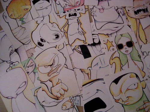
At this point, I had already put in around 15+ hours of work. I was unhappy with the design but kept telling myself to just push ahead. My mind was wandering for more complimentary concepts. I kept thinking of animals and then I thought of the graphic novel,
Mouse Guard. I liked keeping with a book cover (or even movie poster) aesthetic and using warrior mice. I spent my last weekend on this design. I really put my nose to the grind or whatever they say and passed on a trip to Waterworld as well as much needed apartment cleaning. I developed a lot of smaller elements that I hoped would create spooky details once they were placed in the poster. Of course, I again was running into the problem of having created a bunch of things that would have to be scaled up or down and then collaged together digitally. Being the old man that I am, I don’t possess these newfangled digital skills and was going to have to seriously enlist my young modern girlfriend’s help. However, it quickly became obvious that all these pieces were just disjointed in the 11x17 space. There was too much negative space and all the separate parts felt like just that; separate parts.
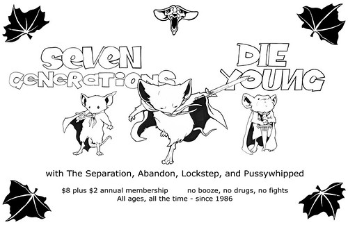
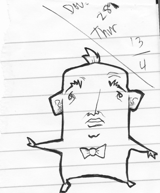
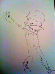
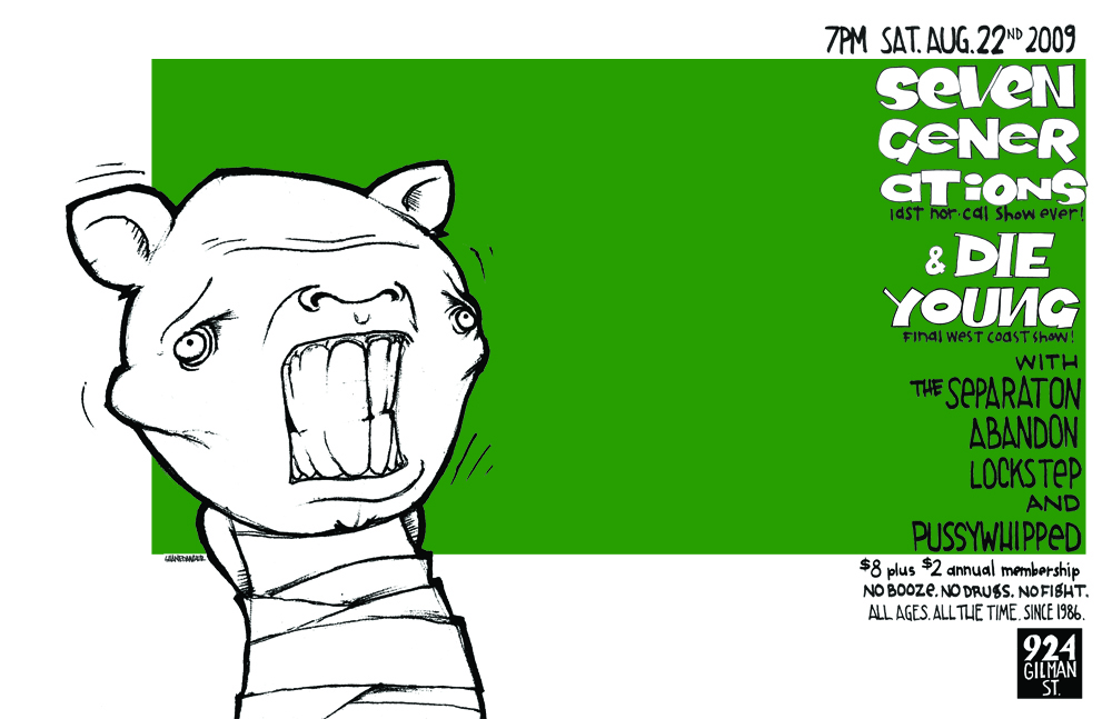
I had a small panic. I prematurely contacted the booker worried that the project was a failure. Luckily, my girlfriend suggested that I use a design of my own creation. This was my original plan and I should have just stuck with it. As we were discussing layout, my girlfriend referenced Jay Ryan and his often minimalistic designs. In the end, we decided that a minimalist design might be too artsy for what the booker probably wanted. We created a less minimalistic design with the character, hand drawn text (a la Jay Ryan), and a strong green field to pop out the black/white design. I was satisfied. I loved how strong the character was and how the text was a secondary element. I felt this was important as it was a commemorative poster; not a marketing flier.

(for some reason, the correct green does not show up here but it does on the linked image)
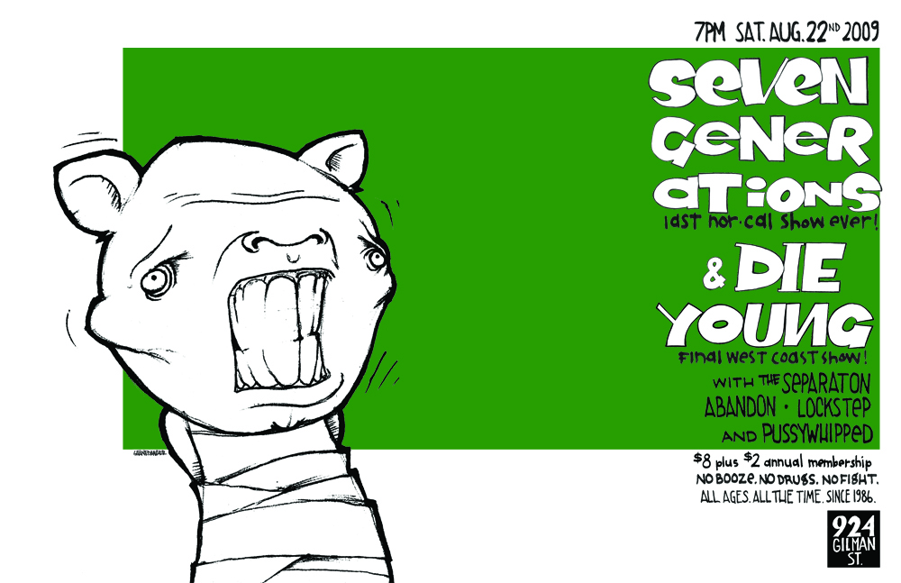
I gave the finished poster design to the booker right on schedule. The next day, he asked that the band text be made “a lot bigger.” The headlining bands’ names were made slightly larger. The idea was for the text to live within a uniform column. To make the text any larger would force me to red-do the entire composition. (You can’t just move one piece of a design and think that the rest of the piece will hold together visually the same way.)
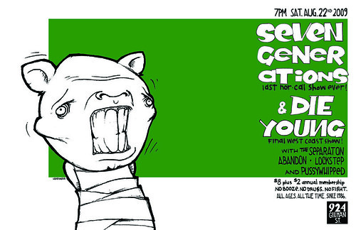
(again, click for correct color)
I didn’t receive any word from the booker for two days. Then I got the following email:
“I talked it over with few people & I just don't think that this works for a poster. I know you put time into it, but it really just doesn't work for drawing people's attention, not to the degree of Gilman shelling out cash to print a poster. Honestly, it's pretty cool but I don't think it's a good design for this show. Sorry. I feel like kind of an asshole about it, but I was honestly expecting something a bit different.”My feelings weren’t hurt or anything. I am a little bummed that my creation won’t be made into a poster. I dedicated a lot of time and energy into holding up my side of the agreement. As a responsible artist, I could have maybe requested more guidelines and/or guarantees but that probably would have also required more time. In the end, I think it just comes down to the booker (and/or whoever he talked it over with) not “getting” minimalist design.